October 2008 Archives

Dit artikel is een kort overzicht van een paar hoogtepunten uit de geschiedenis. Het is een samenvatting van alle artikelen die al eerder door mij gepubliceerd zijn op deze blog. En is bedoeld als een summier maar compleet overzicht met onderstaande conclusie als resultaat:

Conclusie

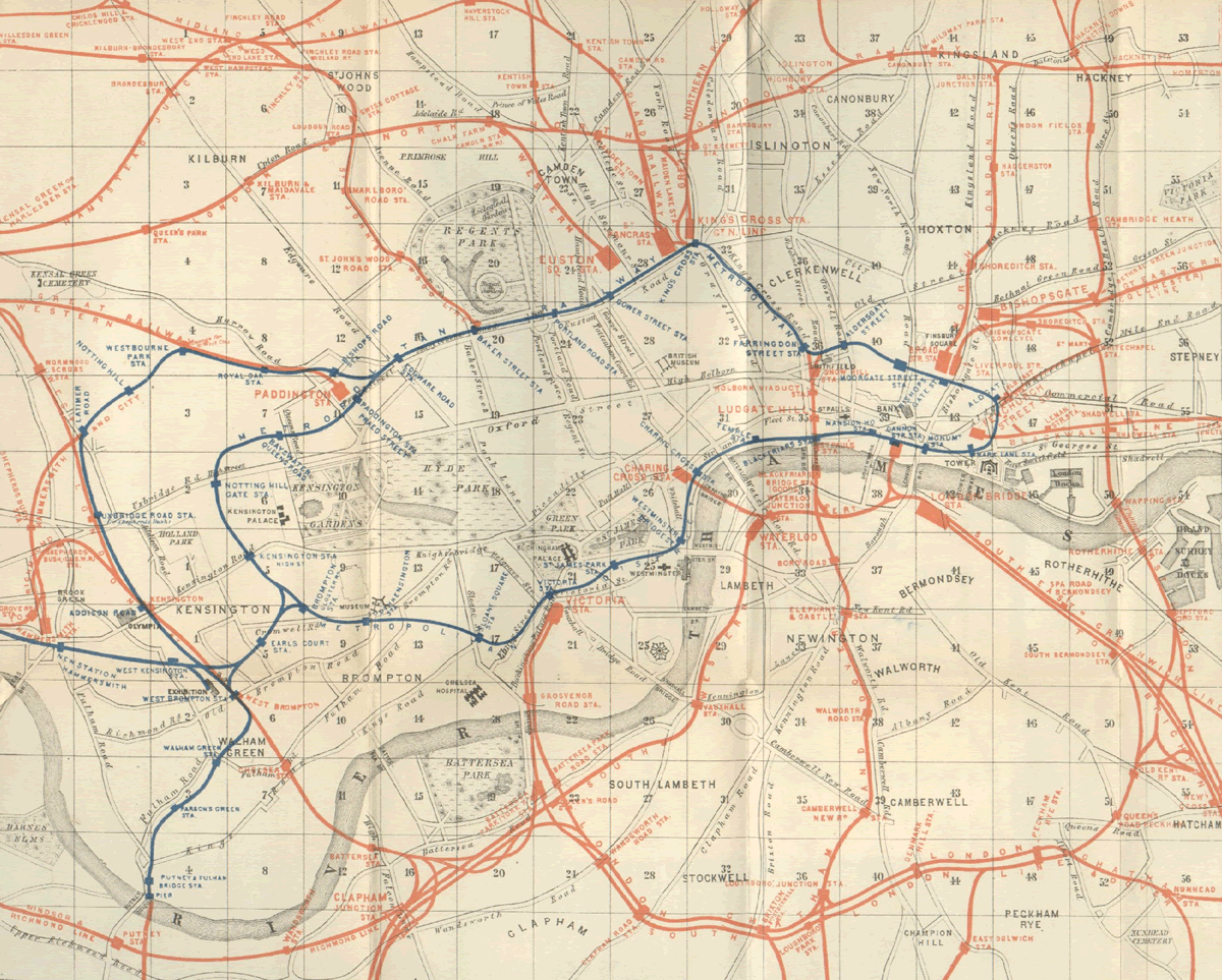
Wanneer je de ontwikkelingen in datavisualisatie vergelijkt met die van de maatschappij zie je dat er vooral grote ontwikkelingen op het gebied van data visualisatie plaats vonden vlak na grote overgangen in de maatschappij.

Vlak na het industriële tijdperk bijvoorbeeld, eind 18e - begin 19e eeuw, was er een enorme opbloei van data visualisatie.

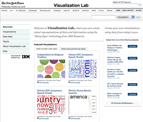
En sinds het post-industriële tijdperk de opkomst van de personal computer (In 1983 introduceerde IBM zijn eerste Personal Computer in Nederland.) zie je een toename de verschillende visualisatie technieken (wordclouds, treemaps, spreadplots).

Vandaag de dag volgen zowel de technologische als maatschappelijk ontwikkelingen elkaar in hoog tempo op. Computers worden steeds sneller, hebben steeds meer rekenkracht om ingewikkelde berekeningen uit te voeren. Het delen van informatie, het participeren hierin, rijke internet applicaties is steeds meer een gemeengoed. Het valt buiten de scope van mijn artikel om in te gaan op de huidige enorme technologische ontwikkeling maar het zal zeker van grote invloed zijn op de datavisualisatie en het presenteren van gegevens. Het is een goed moment om nu te gaan kijken naar de nieuwe mogelijkheden.

Stani Michiels (eerder genoemd in 'Informatie op een munt') heeft een uitleg over het ontstaan van de herdenkingsmunt online gezet.

Links:
De uitgebreide beschrijving van het ontwerp door ontwerper Stani Michiels.
How to make money with free software... by Stani Michiels.

NYTimes_VisualizationLab.gif

A specially for The New York Times developed version of Many Eyes can be used to create visualizations using data from today's news. Users of the website will be able to visualize and comment on information and data sets presented by the NYTimes. They can share those visualizations with others and create topic hubs where people can discuss specific subjects.

Why is the Times working with IBM to distribute Many Eyes on NYTimes.com? Like the creators of Many Eyes at IBM's Visual Communication Lab, The Times believes that users could bring their insight to the process of interpreting data and information and discovering new and innovative ways of presenting them. Just as readers' comments on articles and blogs enhance our journalism, these visualizations - and the sparks they generate - can take on new value in a social setting and become a catalyst for discussion.

The New York Times Visualization Lab

Personally I think it's positive that users can see visualizations of data. It can give more insight in the accompanying news articles. But offering users the opportunity to use that many visualization options is very distracting and leads to nothing.

VisualizationLab_ Data_sets.jpg

When shaping information, either as an designer or as an information manager, it's the chosen view that depicts what is told. See for an example the dutch article "Subjectieve bewijsvoering (Subjective reasoning)" about the cholera map of Snow.

Another example is the Underground Map of London. The map of 1889 tells us about the real geographic locations of the railwaystations. The river Thames, Kensington Gardens, Baker Street, Oxford Street all geographical locations are visible. You could use it for walking to the station entrances.

LondonUndergoundMap_1889.gif

At the start of my career as designer I learned all about collecting information of an customer I could lay my hands on so I could design something that fitted the culture of the company. So at the start of an assigment I collected materials about their identity, their goals, the culture of the company etcetera. Then I filtered all the material to bring order in the pile of information. After that I started to make sketches and notes. And as an final step towards a definte design I selected the sketches that where best in line with the assignment.

This is roughly the same workflow I use when I have to shape the information flow within an company, or when building the information architecture for a big website. Although the end result differs enormously with the different kind of assignments the keywords are always collecting, arranging, analyzing, selecting, interpreting, showing. And I always make little thumbnail sketches. Or schemes. Or visual statistics.

And it was Dan Roam who, in his book 'Drawing on the back of a Napkin' wrote about what I was already doing intuitively for years... He's calling them the 4 steps of visual thinking. And he's using them for solving business problems and selling ideas with pictures. I definitely loved reading the book. And it's suited for anyone interested in visual thinking. Even if you think you can't draw!

Back_of_the_Napkin.jpg

Related information:
Back of the Napkin. Dan Roam.
Digital Roam, his blog, where he writes about Visual thinking and Information visualization
His company Digital Roam where he puts his ideas into practice.

De meest gebruikte manier om met elkaar te communiceren is door het gebruik van woorden. Woorden die bestaan uit verschillende letters en die eenmaal samengevoegd een bepaalde betekenis krijgen.

Dat noemen we ook wel taal. De online van Dale omschrijft taal als: taal de; v(m) talen

  1. spraakklanken waarmee men zijn gedachten en gevoelens aan anderen kenbaar maakt
  2. spraakklanken ve bep. gemeenschap: de Nederlandse ~
  3. dat wat iem zegt, zijn woorden: ~ noch teken geven niets van zich laten horen
  4. (in het algem) middel om gedachten en gevoelens kenbaar te maken: gebarentaal, lichaamstaal

Vijf basisvormen

Nu zijn er, denk ik, vijf basisvormen van taal te onderscheiden.

woordtaal.pngde woordtaal, de meest gebruikte taalvorm die zowel in gesproken als geschreven vorm gebruikt wordt,
systeemtaal.pngde systeem- of cijfertaal zoals bijvoorbeeld het periodiek systeem (geschreven),
beeldtaal.pngde beeldtaal van bijvoorbeeld de statistiek of hiërogliefen (geschreven)
lichaamstaal.pngde lichaamstaal (fysiek) en
gebarentaal.pngde gebarentaal (fysiek) waarbij gedachten worden geuit door het gebruik van gebaren.

Ik wil hierbij eens wat dieper ingaan op één van deze basisvormen: de beeldtaal.

Data visualisatie is een vorm beeldtaal

Wanneer bij een woordtaal de letters woorden vormen die eenmaal samengevoegd betekenisvolle zinnen kunnen zijn dan zou je binnen de beeldtaal Bertin's 'visuele variabele': positie (x- en y-as), omvang (hoeveelheid of grootte), grijswaarde, textuur, kleurtint, oriëntatie () en vorm als letters kunnen zien die met behulp van de vier basisvormen, de woorden, (data kaarten, tijdsreeksen, plaats-tijd narrative ontwerpen en relationele grafieken) kunnen communiceren tot volledige zinnen. Het wordt pas een zin als er ook daadwerkelijk data (de betekenis) aan gekoppeld wordt.

09a.jpg

Dan Roam, 'Drawing on a Napkin'

Een deel van deze visuele variabele van Bertin kwam ik ook tegen bij Dan Roam (Digital Roam) in zijn boek Drawing on a Napkin. Zijn letters zijn basisvormen, lijnen en pijlen, mensen en objecten:

basisvormen.png

Dave Gray, XPlane

Een andere beelddenker, Dave Gray, oprichter van XPLane ('the visual thinking company'), heeft een video gemaakt van wat hij als de bouwstenen van de visuele taal ziet: "Forms, fields and flows".

Vooruit dan, nog een keertje, onbeschamend promotie. Gewoon een goed idee: eenvoudig met een perfecte uitwerking.

About Typechart Typechart lets you flip through, preview and compare web typography while retrieving the CSS.
  • Browse typographic styles. (See "anatomy of a style" below)
  • Download CSS. { 1 }
  • Compare Windows (ClearType) rendering { 3 } with Apple font rendering { 2 }
  • Each style corresponds with a "style ID" { 4 }, which allows you to annotate prototypes and retrieve the css while coding.

Typechart.jpg

Klikkerdieklik naar Typechart >

A Workbook for Graphic Design

Mark Boyce heeft een opvallend boek in drie delen ontwikkeld. Naast een schets- en notitiegedeelte is er ook een sectie waarin de verschillende grafische standaarden en systemen geordend en gevisualiseerd zijn.

phpThumb_generated_thumbnailpng.png

phpThumb_generated_thumbnailpng2.png

phpThumb_generated_thumbnailpng3.png

Archief

Over dit archief

This page is an archive of entries from October 2008 listed from newest to oldest.

September 2008 is the previous archive.

November 2008 is the next archive.

Lees recente content in de linker kolom of blader door het archief om alle content te vinden.

www.flickr.com
This is a Flickr badge showing public photos and videos from Amsterdam, statistisch bekeken. Make your own badge here.
Creative Commons License
This weblog is licensed under a Creative Commons License.
Powered by Movable Type 4.21-en